
Links checked 12/12/13
Warning: Extremely Picture Heavy Entry...


And under different lighting, outside in daylight.


Warning: Extremely Picture Heavy Entry...
Get ready
for more duochromes because this entry continues (and completes) the collection
from Anna’s
Art Asylum, one of my favorite stores on eBay. This entry will cover numbers #55-#59,
first dry swatches and then the polish swatches.
Anna’s Art
Asylum has these
ten colors priced the same as the first set, sold per gram and as an assortment
of 5 for $20.00 ($/gram)- you pick your colors. Shipping is
free via USPS. The ten are numbered #50-#59, no names and are an even mix of
white and orange base colored powders. The picture below shows how the pigments are packaged, each
gram in a small bag with the number written on a holographic label.

#50-#54 in the top row, #55-#59 on the
bottom. Photographed in daylight, indoors.
First
up for individual dry swatches is #55

#55 is a golden pigment that, almost confusingly, goes from
a pink to a subdued green to a vibrant one when in dry form. The particle size is
somewhere between TKB Trading's MoonDusts and Star
Bites, large enough to sparkle but small enough to give fairly even coverage.

The fingertip swatch doesn't show
the lime color but it's there. Photo taken indoors, daylight lamp.

The dry pigment on double-sided sticky tape. The pink here is more rose-toned than bright.
Next
is #56

#56 is another slightly confusing pigment when you compare
the various photos. In the bag and on paper, it looks like a pink to purple to
a bluish purple transition but on the finger what comes out is pink &
orange. The particle size is finer like that of TKB Trading's Moon Dusts- or #22808 from Anna's first set.

As I said, this swatch looks nothing like the others
although I used the same camera settings and lighting. It looks so off I had to
go back and make sure I didn't have the wrong pigment. Photo taken indoors,
daylight lamp.

Captured here on double sided sticky tape.
Third in the lineup is #57

#57 is definitely an odd color. The pigment itself is a reddish pink but the color transition goes from a cheery pink into a light purple into a blue with brown undertones. The brown comes through in some lighting but it's not overwhelming. The particle size is larger and full of sparkle, like TKB's Shanika Sun.

It doesn't usually work out this way but this fingertip swatch shows the complexity of the colors well.

And my paper swatch. Until it hits blue, the brown is invisible.
Fourth is #58

#58 looks like TKB's Luna Blue from the Moon Dust collection in both color and particle size although they aren't quite the same hue.

Pale white powders never cooperate. Look close enough and you can see all three colors that, at first glance, could pass for a shadow.

I might have the paper swatch reversed here color-wise, maybe it should be going from aqua to purple since I compared it to Luna Blue but it demonstrates color shift either way.
And the last color, #59

I consider #59 to be the more green tinted cousin of TKB Trading's Red Sparks and with a larger particle size, the more sparkly of the two. And no, the fact that this is a golden powder while Red Sparks is white doesn't change my opinion.

On the finger this is a very warm color, similar in appearance to #481804...

... but on paper the pink tone disappears and is replaced with orange and the green becomes sharper.

All five bottles, same order: #55, #56, #57, #58 and #59.
The
recipe for these is a simple one, just 4 drops of pigment mixed with 1/3 clear
and 2/3 Glamour
Base- this ratio seems to work best for the consistency of the polish. The bottles are TKB's
Elizabeth so these are between 5-6ml.
The nail swatches I did as skittles layered over black acrylic nails, which I think really brings out the color shift in duochromes. They are in the same order as the bottles, #55, #56, #57, #58 and #59.
The nail swatches I did as skittles layered over black acrylic nails, which I think really brings out the color shift in duochromes. They are in the same order as the bottles, #55, #56, #57, #58 and #59.
This photo, like the others with the same background, was taken indoors under the daylight lamp.

Outdoors in daylight, no sun.


Alternate View:
#55

These photos are indoors, during daylight hours but under a
"daylight" lamp.

And under different lighting, outside in daylight.


#56

These photos are indoors, during daylight hours but under a
"daylight" lamp.

And under different lighting, outside in daylight.


#57

These photos are indoors, during
daylight hours but under a "daylight" lamp.

And under different lighting,
outside in daylight.


#58

These photos are indoors, during daylight hours but under a
"daylight" lamp.

And under different lighting, outside in daylight.


#59

This photo was taken indoors, during daylight hours but
under a "daylight" lamp.

And under different lighting, outside in daylight.


The group photos don't require a lot of editorial comments from me.
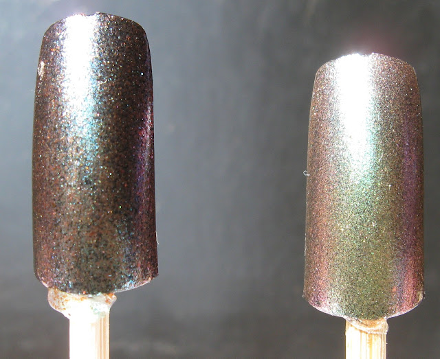
#54 & #55, indoors.

This isn't the best picture but I
wanted to give you a frame of reference for comparison, because the outdoor
photos are next. This was taken under the "daylight" lamp.

Outdoors, full sunlight.

Outdoors in daylight but no sun.
And the picture I concluded the
last entry with, also outdoors.

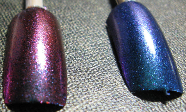
#55 & #56, indoors


Outdoors and in daylight.


#55, #56, & #57 indoors.


Outdoors, daylight but no sun.
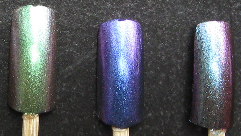
Outdoors, full sunlight.

#56 & #57 outdoors, full
sunlight

And outdoors again.

#57 & #58, outdoors


#57 & #58, indoors and under
"daylight" lamp.


#58 & #59 outside....


Indoors and under
"daylight" lamp.


After part two is completed with accompanying text, #55-#59, I intend to do a
comparison between Anna's 20 duochrome pigments and TKB
Trading's Star
Bites and Moon
Dusts collections. I also intend to update the pictures for Anna's first duochrome set, the Star Bites and Moon Dusts along with more photos for the prior entry. -MK
These were sent to me for review.
Related Entries: