Anything "Duochrome" or "Chameleon" can also be found using the tag "Color Shifting"

Updates & Notices

Warning: This blog and some info within is out of date. The date of any updates are usually noted at the top of each page/entry. As of 1/08/20, all pages have had dead links removed/repaired as well as 2010 entries and 2011 Jan-July.

Monday, March 21, 2011

Blog Neglect

March is a funny month in terms of weather with winter not gone completely and spring not quite here; while it is sometimes mild and sunny, more often it's cold, wet and gloomy which is not conducive to my good mood or my hobbies.  

I don't have much to say but I haven't forgotten about my blog or the followers I have- thank you, ladies. –MK

I can't wait for spring...

Friday, March 4, 2011

Alternatives to TKB's discontinued Pops

Links checked 12/12/13
12/05/19: Coastal Scents no longer sells mica pigments in bulk period and so, any links here that go their website have been removed. The Conservatorie is also closed so those links have been removed too.

As many of you may be aware TKB Trading has stopped selling the Pops line of pigments because their manufacturer discontinued them. While they continue to search for suitable replacements, they suggested using some other pigments in their place. I have a few more, based on the pigments I own and not all from TKB. I'm hoping that whoever reads this may own one or two of these so they don't need to go out and buy the replacement.

I've included pictures of all the Pops paired up with the suggested replacements, the exceptions being TKB's True Coral, True Red/Orange and Amethyst which I do not own.

3/09/11: After doing some reading on TKB's forum I'm going to say this because I don't want this entry getting miscontrued. I am a loyal customer of TKB Trading, the majority of my pigments are TKB's- because they have what I consider a good selection, good prices and good customer service. I also buy from Coastal Scents and The Conservatorie for much the same reason. And I stick with the companies that make me happy. That being said, I'm not encouraging anyone to be less appreciative of TKB Trading. They will find a replacement, I have no doubt of that. I suggested pigments to use that I had on hand, no different than if I was waiting on a new order but time was important. Even Betty Crocker has listed substitutes for ingredients in the cook book.


TKB Trading
The Conservatorie
Coastal Scents
* denotes contributed by Kristina (original message shown below). Thank you, Kristina.
Strawberry Pop

Primrose

Raspberry Pop
*Crimson Coral
Tangerine Pop
or
Peach Sunset
Metallic Rustic Gold

*2 parts Canary Yellow + 1 part Crimson Coral = Tangerine Pop match
Lemon Drop Pop

*Canary Yellow
Apple Green Pop

*2 parts Canary Yellow + 1 part Cerulean = Apple Green Pop match
Blueberry Pop

*Cerulean
Grape Pop
or 
Violet
Orchid Shimmer

TKB's Strawberry Pop and Raspberry Pop are very similar but The Conservatorie's Primrose fits nicely in the middle. It has a slight brighter pink interference. Shown here from left to right: Strawberry Pop, Primrose & Raspberry Pop.
 

Coastal Scents' Metallic Rustic Gold and TKB's Aztec Gold are virtually identical so MRG has been omitted from the finger swatches. The Conservatorie's Fenda Orange, also aptly named Peach Sunset, is as vivid an orange as TKB's Tangerine Pop but with a slight peach interference. Shown here from left to right: Metallic Rustic Gold, Aztec Gold, Passion Orange, Tangerine Pop & Fenda Orange.

I suspect The Conservatorie and Coastal Scents may have potential yellows, greens and blues similar to the Pops but as I don't own them I'll keep my opinions to myself.

Shown here from left to right: TKB's True Yellow & Lemon Drop Pop. They are not green-toned, my fingers are underneath.

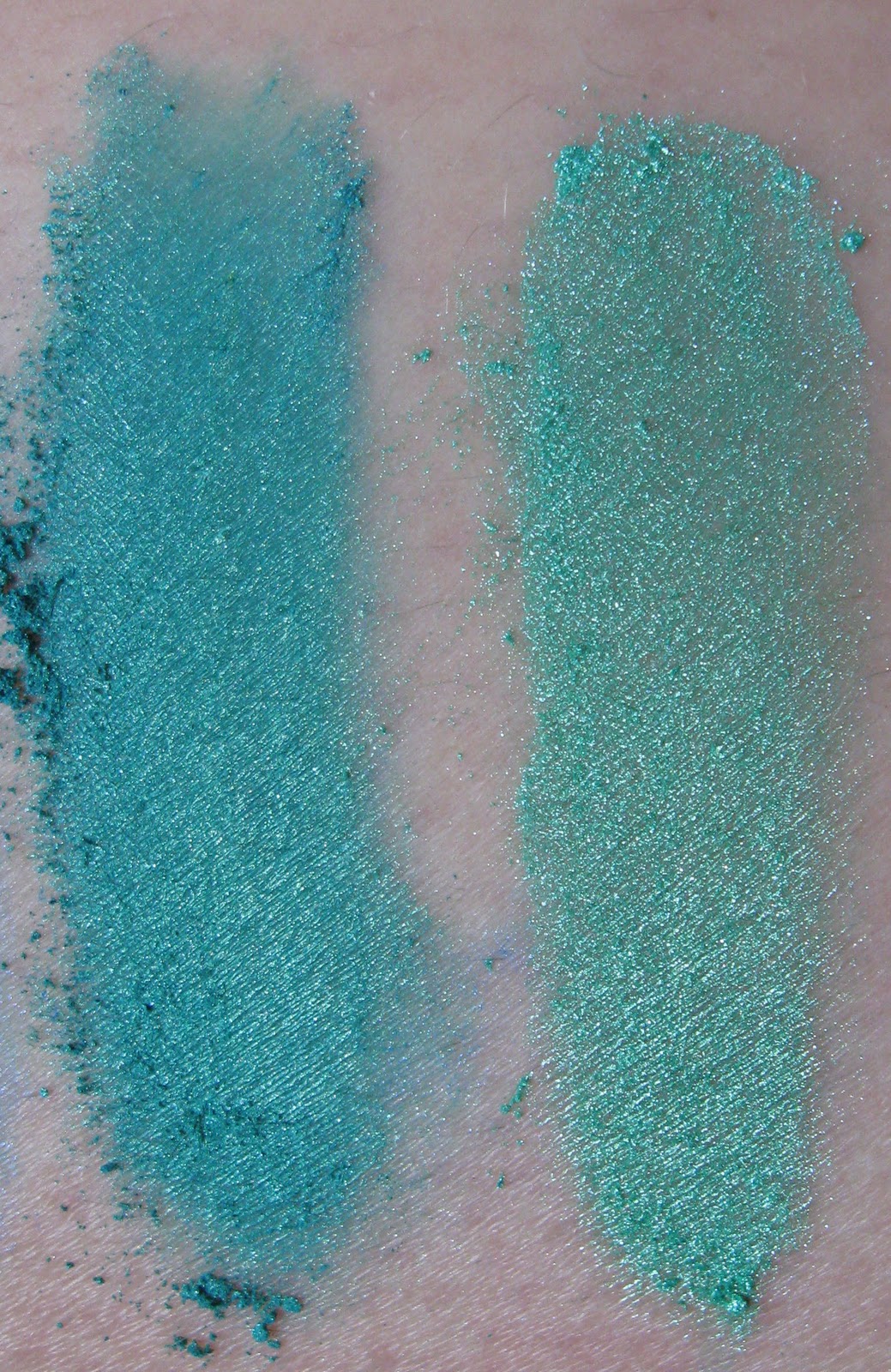
Shown here from left to right: TKB's True Green & Apple Green Pop

Shown here from left to right: TKB's Blueberry Pop & True Blue.

For Grape Pop, TKB suggested Patagonian Purple or Amethyst, not shown. I think The Conservatorie's Violet or Coastal Scents' Orchid Shimmer could also fill that role. Shown here from left to right: Patagonian Purple, Grape Pop, Violet & Orchid Shimmer.

If I find other pigments I'll post them but for now that's it. -MK

Related Entries:

Thursday, February 24, 2011

Best Buy Supplies 3

Everything Updated 4/22/16

I acquired a few more frankenpolish supplies recently, containers for pigments and color recipes from SKS Bottle and a silicone sheet like the one TKB Trading originally had listed but was out of stock on. TKB Trading has replaced the Norpro version with a different one but the link still works.

Periodically I go check TKB's "New!" page for updates and the last time I did, I watched the Franken Polish Tools video Mrs. Westerman had posted where she talks about and demonstrates many of the items listed on the page. The one that caught my eye was the Silicone Sheet. This now sells for $12.65. The major selling point for me is not that it helps keep your work area clean, because I have a variety of plates, paper and foil I normally use for that, but that nail polish won't stick to it, it can be peeled right off when dry. This has enormous potential to me.

I've said many times that I want swatches of the polishes to keep as a reference but I also have my swatch papers where I save and label the small color mixes I'm trying out. When doing that of course, the color of the paper it is swatched on is important because even a slight yellow tint to white is going to throw off the color of the sample. If polish doesn't stick to silicone, then those small samples of mine could be mixed right on the sheet, peeled off afterwards and preserved on any paper.

I've learned to ignore my initial urge to buy something because if I didn't, I'd be penniless but this time I waited too long and as I said, TKB Trading's silicone sheet was out of stock. Not willing to wait any longer I searched for alternatives on eBay, always a good reference, and ultimately found out that the silicone sheet was:  

Norpro brand
Size: 19 1/2" x 15 1/2"
•Flexible, nonstick silicone offers instant, easy release without the use of grease
•Pastry sheet with guideline measures for rolling out dough or pie crusts from 6" to 15"
•Doubles as a baking sheet liner: Allows for even heat distribution, helps prevent over browning on the bottom of baked goods, and replaces the need for parchment paper, butter or nonstick sprays.
•Oven safe to temperature of 450F/230C.
•Also, great for freezing or stretching candy.
•Nonabsorbent silicone keeps moisture in your food and won't retain odors.

The others that were on eBay, Good Cook, Silpat etc were not as large as the one made by Norpro so that's what I settled on and found the best price at Jack's Country Store. I paid $5.99 for the silicone sheet and $5.00 shipping for a total $10.99, $1.00 less than buying from TKB. Updating prices the price has gone up to $11.99.

My second purchase was from SKS Bottle, the company I've bought my 4 ounce containers from. I was on the hunt for vials like the ones my glitter from the Hobby Lobby came in, roughly 1/2" in diameter x 2" tall. The caps have a 1/8" diameter hole for easy dispensing and liquid-wise, they hold 3ml.

Their size made them ideal for taking my supplies with me to my father's every weekend; enough glitter to play with without taking up much room. I wasn't able to find anything identical but I found the next closest thing (for me) from SKS Bottle, Clear Styrene with Snap Caps, shown below. I bought the 2 ½ dram vials and the 7 dram vials after having converted drams to milliliters. The standard polish bottle is 15ml while a mini bottle is 3.6ml.

The clear styrene vials with snap top caps will allow the natural color of your product to show through. The styrene vials could possibly be used to package bath salts, herbs, spices and more.

0710-12
2 1/2 Dram Clear Styrene Vials w/ Snap Caps
2 ½ drams = 9.2ml
40 mm x 18 mm (or 1.57 inches by 0.71 inches)
144/bag = $20.74
----------------------------------------------------------------
0710-03
7 Dram Clear Styrene Vials w/ Snap Caps
7 drams = 25.8ml
55 mm x 27 mm (or 2.17 inches by 1.06 inches)    
144/bag = $29.66

Here the containers are shown together.

The 2 ½ dram vials were for my "portable pigments" but I bought the 7 dram for storing my color recipes in. The 30 gram jars I currently use are from TKB Trading, 2" diameter; 1" tall (or 50 mm Diameter x 25 mm tall) and will hold 9 grams weight of pigment. I'm running low on those and knowing SKS Bottle was going to get me on the shipping because they only use UPS, I bought the 7 dram as well.

Shipping was $15.23 via UPS but fast- I ordered them in the evening of February 18th so not counting the weekend, processing to delivery only took 4 days. This makes my third order placed with SKS Bottle and every time I've found them to be responsive, quick and reliable. The only con is using UPS for shipping so if you're going to buy from there, order enough to make the expense worth it- there was only a $2.00 increase in shipping for my adding on the second set of vials.

Another handy item to buy that I actually bought years ago are the set of 5 mini spoons that TKB Trading sells for $5.89. These spoons have multiple uses. They are (were) used to covert the color recipes on TKB's website although the majority of those have been pulled since the Pops collection was discontinued. I use them for my own pigment color recipes as well. The drop spoon I use most often when frankening because of the conservative amount it holds and because it will fit in the neck of most polish bottles. These are also far more durable than the plastic alternative and the measurement name is imprinted in the metal so the name will never wear off.

Glitter Unique sells these mini spoons as well, for only slightly less, $5.50 in which case I'd choose the company I'm aleady ordering something from (saves on shipping).

-MK

Related Entries:

Saturday, February 19, 2011

Color Recipe Flubs

Links checked 12/12/13

I spent my day yesterday messing around with my pigments trying to create something new in addition to trying to tweek The Conservatorie's Shamrock. After several hours and two flubs I decided I'm not much good at it. I often forget to factor in that the color is going to darken when it's added to polish and some interference pigments will be diminished; what looks great "dry" is less remarkable in polish.

So after Shamrock ended up looking like a cross between Coastal Scents' Duocrome Iridescent Green Gold Mica and Gemtone Topaz Mica (I could've sworn that was Gemstone) and my 30 gram container was too full to continue, I started wondering what does everyone else do when their color recipe fails? Do you set it aside, hopefully to go back later and fix it? Do you give it away to someone else or forget about it altogether? Would anyone else even want something like that?

What do you do? Fill me, let me know. Got suggestions, ideas? You can tell me that too. In the meantime I'm going to pack my flubs away along with the frustration before my white walls go green and not in the environmental way. -MK

Monday, February 14, 2011

Franken: #233 Ultra-Marine

Links checked 12/12/13

I chose to post this particular franken polish because it's a striking color and different than anything else I've bought or made; so named Ultra-Marine because it closely resembles my Prismacolor color pencil Ultramarine.

The supplies I used were: Coastal Scents' Sparkle Blue, TKB's Blue Franken Base, clear polish, the normal sized polish bottle and Sinful Colors Let's Talk and Gorgeous purchased at my local Walgreens for $1.99. I also used the Drop spoon from TKB Trading's mini 5 spoon set.

The photo below was taken indoors with a "daylight" lamp.

This was taken outdoors but no sun. Hopefully it gives you a better idea of how purple Let's Talk is compared to my Ultra-Marine and also shows Gorgeous, a very pretty green blue.

Below are the Coastal Scents pigments, Metallic Sapphire, Sparkle Blue (center) and Blackstar Blue, photographed indoors in sunlight. Sparkle Blue is one of the most sparkly blues I own and one of the most recent so I chose to use it.

I like to use a permanent marker to mark my bottle in fourths because this helps me gauge how much polish I'm putting in and it comes off fairly easily. It should go without saying that we always start with dropping in the two BBs.

I filled the bottle slightly over half full with clear polish and added 4 drops of Coastal Scents' Sparkle Blue before shaking it well. While it was certainly sparkly it was not much different than Metallic Sapphire Blue in polish so I added approximately 15 drops (liquid, not to be confused with the spoon) of TKB Trading's blue colored base which resulted in a much more intense and darker blue. Again, it was sparkly but not vastly different from other blues.

By now I'm starting to get a little frustrated but the bottle is only a little over ½ full so I've got some wiggle room. It seems a good idea to make it a greener blue so I added ¼ of Sinful Colors Gorgeous only to find after shaking it again that it wasn't that different. Why strive for "different"? Because after 291 bottles I struggle for originality and end up with the occasional flub and I hate waste. With ¼ left empty whatever I did was going to have to be good.

On a piece of my swatch paper I mixed a small sample of what I had made so far and the Sinful Colors Let's Talk, one of my favorite purples and was pleasantly surprised; I added an additional ¼ of Let's Talk and ended up with quite the happy accident.

Now before I start showing you the photos of the actual manicure, let me say that I did not do the clean up before taking the pictures, nor did I top coat it. With 4 coats required and my patience limited I chose to forego those steps in favor of capturing the color before I had enough time to screw it up.

Photographed outdoors, no sun. Not the clearest but the best one out of what I took. And yes, my pinkie is longer than the rest of them but I refuse to cut it back. I break nails regularly and easily so it will no doubt do so on its own.

The two above were photographed indoors under the daylight lamp. In the background of the first is Sinful Colors Let's Talk.

The next four were taken indoors in direct sunlight this morning.


 It's not quite blue in person or purple but it became an instant favorite of mine. -MK

Friday, February 11, 2011

Swatches: TKB Trading Warms

Links checked 12/12/13

Since the sun came out today, I decided to take a break from trying to crack the color code and complete the TKB Trading swatches, the warm color range. All pictures, unless stated otherwise, go from left to right. In each set, the first was taken in daylight, the second in sunlight.

In the yellows and golds are: True Yellow, Lemon Drop Pop!, Crucible Khaki, Hilite Gold, Brilliant Gold, Radiant Gold, Crucible Gold and Forged Gold.
Crucible Khaki (dupe for Coastal Scents' Metallic Olivia- view here), Crucible Gold and Forged Gold are all great metallic pigments but as such, seem to go bad no matter what polish I put them in.

True Yellow, Lemon Drop Pop!, Crucible Khaki & Hilite Gold.

Brilliant Gold, Radiant Gold, Crucible Gold & Forged Gold.

The oranges are: Hilite Orange, Hilite Copper, Lovely Leo, Sparkle Bronze, Australian Amber, Passion Orange, Umber, Copper Penny, Tangerine Pop! and Aztec Gold.
Sparkle Bronze, as the name implies, is very sparkly which makes it one of my favorite colors. Passion Orange and Umber are two more favs, Passion Orange because it is a bright, nearly metallic orange and Umber because it's another good sparkly pigment. Australian Amber is more brown than amber colored so I've never used it in a polish. Aztec Gold is nearly identical to Coastal Scents' Metallic Rustic Gold, view comparison here.

Hilite Orange, Hilite Copper, Lovely Leo & Sparkle Bronze.

Australian Amber, Passion Orange, Umber & Copper Penny.

Tangerine Pop! & Aztec Gold

For the reds we have: Gemtone Ruby, Red Basics, Queen Kathryn, Crucible Red and Deep Russet.
An argument could be made that Gemtone Ruby should be with the pinks but the color order was determined by how the pigment appears in polish and in polish, Gemtone Ruby is darker and redder. Crucible Red is another great metallic but when in polish becomes dark orange and, in my case, goes on the bad list for not playing well with polish.

Gemtone Ruby, Red Basics & Queen Kathryn

Crucible Red & Deep Russet

And finally, pinks: Sparkle Rose, Foliage, Hilite Red, Raspberry Pop!, Strawberry Pop! and Scarlett O’Hara.
Sparkle Rose is another favorite for it's super sparkle and gold interference. It goes well with Chrome Carmine and Duocrome Red Orange from Coastal Scents. Foliage has a match with the other two major pigment companies, Coastal Scents and The Conservatorie but I only own this one and I don't care for it. It's an almost mauve pink with a more violet pink interference. I think of Scarlett O'Hara is a cheaper alternative to Pinky Pink. It's not quite as glittery as Pinky Pink but they are similar in shade and Scarlett has the feel of a fine glitter but without being derived from plastic.

Sparkle Rose, Foliage & Hilite Red.

Raspberry Pop!, Strawberry Pop! & Scarlett O’Hara.

Related Entries: