
Links checked 12/12/13
This is part 2 to a 3 part posting of some fantastic pigments I purchased from Anna’s Art Asylum- click here to see Part 1. This will cover #412604, #412605, #35202 & #821502 with pictures of dry swatches, franken polish bottles and finish with the polish swatches themselves.


All 10, as polish, layered over black. Photos taken outdoors.


The first one for today is #412604


 This has a color shift that goes from an almost lime green to vivid pink under the proper lighting. and reminds me somewhat of Studio M's Alias. #821502 has a slightly smaller particle size but not as fine as #22808.
 Because it's white, this is pale but both colors are visible.


This is part 2 to a 3 part posting of some fantastic pigments I purchased from Anna’s Art Asylum- click here to see Part 1. This will cover #412604, #412605, #35202 & #821502 with pictures of dry swatches, franken polish bottles and finish with the polish swatches themselves.
To review, Anna’s Art Asylum and the lovely Anna, sells 10 different duochrome pigments and none are identical to TKB Trading’s Travel to’s, Star Bites or Moon Dusts pigments. While TKB’s are mostly cool colors, Anna’s cover the other end of the spectrum by offering several warm colors. These can be purchased as an assortment of 5 for $20.00 ($/gram), free shipping. Since I wanted all 10, I selected the 5 for $20.00 option twice (I emailed Anna prior to confirm this was ok).

This is how the pigments are packaged, each gram in a small bag with its name written on a holographic label (I went back over the names in permanent blue marker). Both this one and the one below were photographed at the table under "daylight" lamp light.

Just to be organized and because I like the way it looks, I put them all on a binder ring in color order.
All 10, as polish, layered over black. Photos taken outdoors.

#362801, #462805, #22808, #481804, #412604

#412605, #35202, #821502, #35204, #221501
Alternate View:

Alternate View:
The first one for today is #412604

#412604 looks similar to some of the others in the bag but it's really not, it transitions between purple to pink to orange (over black). By itself as a dry pigment, it goes from golden orange to orange to pink. Particle size is somewhere between TKB's Shanika Sun and Marinda Star.

On the fingertip more of the pink hues come out but it still appears similar to the others.
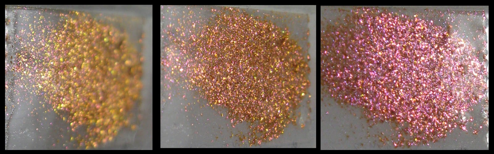
The dry pigment on double-sided sticky tape. Here the color shift is clearer and shows all three phases when used over white.
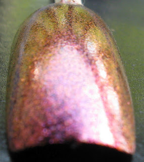
Next is #412605.

Being that this one, number-wise, comes after 412604, there's similarity in the colors but this one brings bright pink into the color shift with a brighter orange. Same particle size as the others.

All the colors are showing on the fingertip although the pink is muted.

It really is a nice color combo, reminds me of the classic sunrises and sunsets.
Since the next four are whites, we're going to do the pictures a little different.
Third in this installment is #35202.
Since the next four are whites, we're going to do the pictures a little different.
Third in this installment is #35202.

The blue in this one is hard to coax out but here in the bag it shows- it goes from blue to purple to purplish pink, but like most white interference pigments, bright lighting washes out the color. The particle size matches the others so it's more sparkly than it appears.

A very slight touch of blue but mainly pinks and purples.

The range in this one looks limited but as I said before, it has a much stronger blue interference.
The last color in this set is #821502.


Looking more purple than pink here.

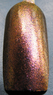
All four in bottles, same order: #412604, #412605, #35202 and #821502
Both taken indoors, direct sunlight

Bottom of the bottles
All followed the same simple recipe, just 4 drops of pigment mixed with 1/2 clear & 1/2 Glamour Base. Even though I cut the Glamour Base by half, the majority of the pigment has remained suspended. The bottles are TKB's Elizabeth so these are between 5-6ml.
The nail swatches I did as “skittles” and all are layered over basic black polish. They are in the order of #412604, #412605, #35202 and #821502- #35202 required 2 coats while the others were 3.
The second set, and it will be obvious when the second set begins, were also done as skittles but on my nail sticks. These sticks are black acrylic nails which saved me time and layers of black polish.


The second set, and it will be obvious when the second set begins, were also done as skittles but on my nail sticks. These sticks are black acrylic nails which saved me time and layers of black polish.
These were taken directly under a daylight lamp.


Away from the light source.


Different rooms, regular light.


Not the best pictures but...
indoors under a simulated daylight lamp. Same order

Outdoors from different angles, no sun.


#412604 & #412605, outdoors, no sun

#35202 and #821502, outdoors, no sun

#412604


#412605


#35202


#821502


The variation to these pigments seems endless when I look at all the pictures I took under different lighting conditions. Even with my lack of photography skills.
Since I only use four fingers at a time, #35204 & #221501 will be featured in the next entry. Check back soon- MK
Related Entries:
which one of the first two has the best blue/magenta/dark pink/reddish shift? I want to try the one on your middle finger. Which pigmment is that? The pictures angle changes makes it harder to track, LOL!
ReplyDelete412604 leans more towards reddish pinks/oranges while 412605 is more truer pinks/purplish color. 412605 is also the one on my middle finger.
Delete