Links checked 12/12/13
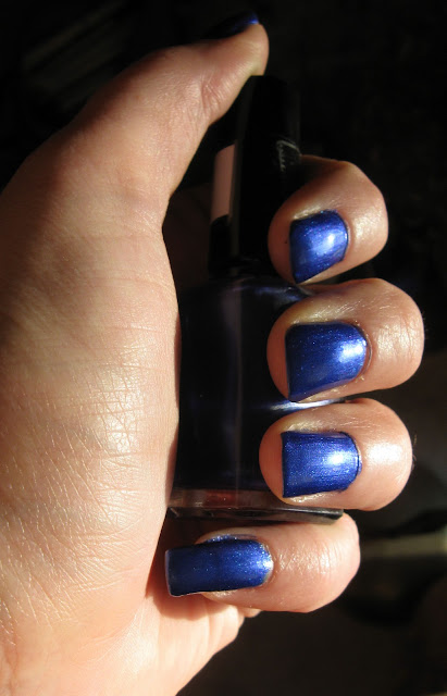
I chose to post this particular franken polish because it's a striking color and different than anything else I've bought or made; so named Ultra-Marine because it closely resembles my Prismacolor color pencil Ultramarine.
I chose to post this particular franken polish because it's a striking color and different than anything else I've bought or made; so named Ultra-Marine because it closely resembles my Prismacolor color pencil Ultramarine.
The supplies I used were: Coastal Scents' Sparkle Blue, TKB's Blue Franken Base, clear polish, the normal sized polish bottle and Sinful Colors Let's Talk and Gorgeous purchased at my local Walgreens for $1.99. I also used the Drop spoon from TKB Trading's mini 5 spoon set.
The photo below was taken indoors with a "daylight" lamp.
This was taken outdoors but no sun. Hopefully it gives you a better idea of how purple Let's Talk is compared to my Ultra-Marine and also shows Gorgeous, a very pretty green blue.
Below are the Coastal Scents pigments, Metallic Sapphire, Sparkle Blue (center) and Blackstar Blue, photographed indoors in sunlight. Sparkle Blue is one of the most sparkly blues I own and one of the most recent so I chose to use it.
I like to use a permanent marker to mark my bottle in fourths because this helps me gauge how much polish I'm putting in and it comes off fairly easily. It should go without saying that we always start with dropping in the two BBs.
I filled the bottle slightly over half full with clear polish and added 4 drops of Coastal Scents' Sparkle Blue before shaking it well. While it was certainly sparkly it was not much different than Metallic Sapphire Blue in polish so I added approximately 15 drops (liquid, not to be confused with the spoon) of TKB Trading's blue colored base which resulted in a much more intense and darker blue. Again, it was sparkly but not vastly different from other blues.
By now I'm starting to get a little frustrated but the bottle is only a little over ½ full so I've got some wiggle room. It seems a good idea to make it a greener blue so I added ¼ of Sinful Colors Gorgeous only to find after shaking it again that it wasn't that different. Why strive for "different"? Because after 291 bottles I struggle for originality and end up with the occasional flub and I hate waste. With ¼ left empty whatever I did was going to have to be good.
On a piece of my swatch paper I mixed a small sample of what I had made so far and the Sinful Colors Let's Talk, one of my favorite purples and was pleasantly surprised; I added an additional ¼ of Let's Talk and ended up with quite the happy accident.
Now before I start showing you the photos of the actual manicure, let me say that I did not do the clean up before taking the pictures, nor did I top coat it. With 4 coats required and my patience limited I chose to forego those steps in favor of capturing the color before I had enough time to screw it up.
Photographed outdoors, no sun. Not the clearest but the best one out of what I took. And yes, my pinkie is longer than the rest of them but I refuse to cut it back. I break nails regularly and easily so it will no doubt do so on its own.
The two above were photographed indoors under the daylight lamp. In the background of the first is Sinful Colors Let's Talk.
The next four were taken indoors in direct sunlight this morning.
It's not quite blue in person or purple but it became an instant favorite of mine. -MK


This looks very creamy. 4 coats is a lot! Takes too long to dry :S
ReplyDeleteSurprisingly not as long as you'd think. I did 3 coats in a little over an hour and the 4th the next day... woke up with very few dents.
ReplyDelete