
Links checked 12/12/13
The sunlight was willing for a couple days so I decided to continue swatching with TKB Trading pigments, the cool color range (and neutrals). All pictures, unless stated otherwise, go from left to right. In each set, the first was taken in daylight, the second in sunlight.
The neutral color pigments are: Pearl White, Polished Silver and Black Mica.


For purples we have: Sparkle Blue, Libra Blues, Hilite Violet, Bishops Violet, Grape Pop!, Sagittaire, Patagonian Purple and Aster Hue.


Sparkle Blue reminds me a lot of Her Majesty (not shown) because both are blue based with purple highlights. Hilite Violet, like the rest of white interference pigments, doesn't like to show up in pictures but it is a nice violet color, neither too purple or pink and different from all the other purple-hued interference pigments. Libra Blues is nearly matte but has a purple undertone that is more apparent wet such as in polish. Bishop's Violet, similar to Coastal Scents' Mauve Quartz, has a pinkish-purple interference that is more dominant than seen above.
Sparkle Blue, Libra Blues, Hilite Violet, Bishops Violet below.


As you can see Sparkle Blue has a large particle size making it one of TKB Trading's most sparkly colors.
Grape Pop!, Sagittaire, Patagonian Purple and Aster Hue


I love Grape Pop and consider it to be an essential purple to own, for the color itself and for creating other vivid purples. Aster Hue
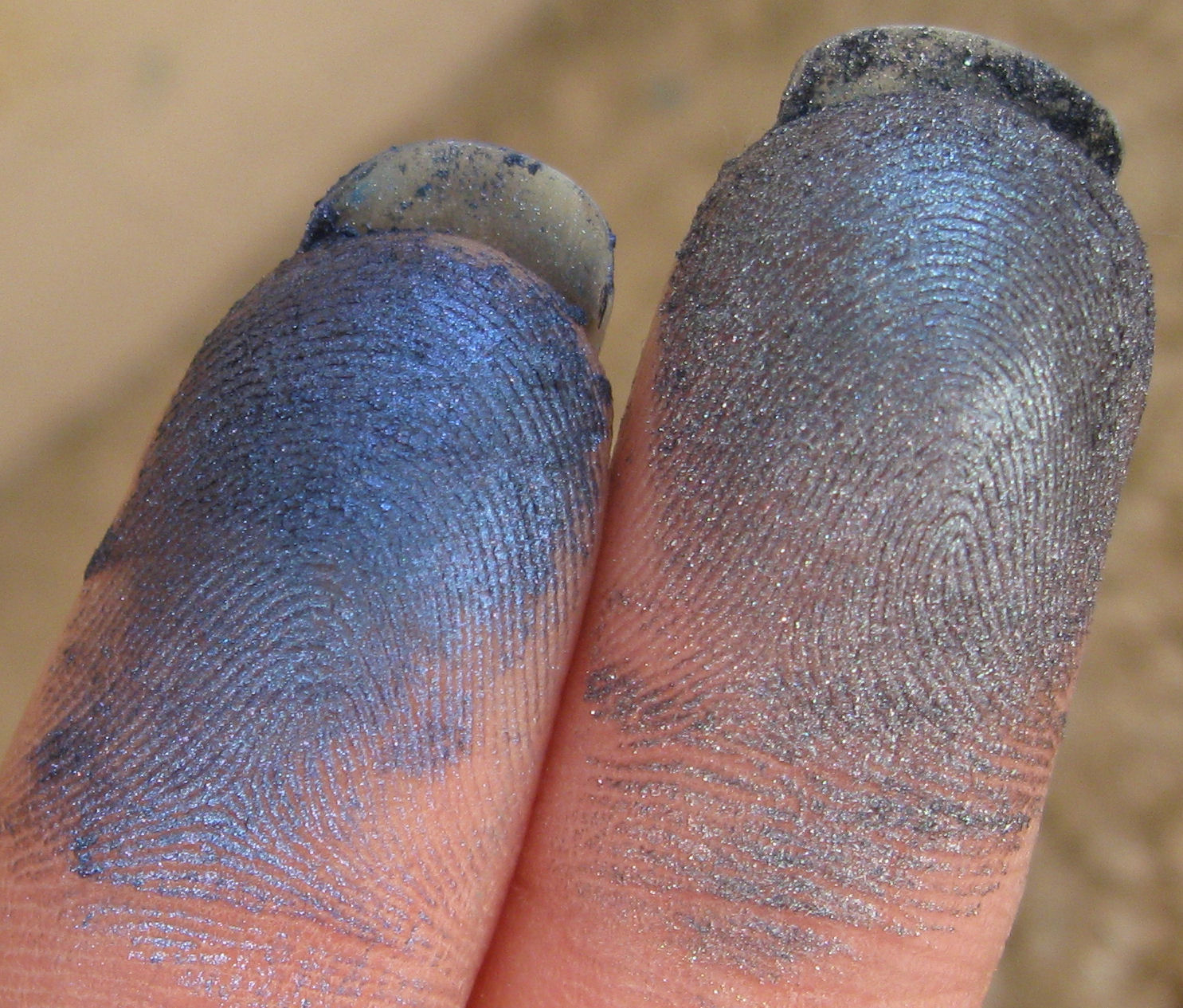
The blues are: Hilite Blue, Colorona Blue, Periwinkle Blue, True Blue, Blueberry Pop!, Grape Parfait, Colorona Dark Blue, Midnight Blue, Deep Blue and Blue Steel.


Hilite Blue is blue when viewed at an angle. Periwinkle Blue looks green in the container but comes across as blue when swatched and an even sharper blue when used in polish. Grape Parfait could go with the purple family but it's blue-tinted interference puts in with the blues. Deep Blue is too gray for my taste.
Hilite Blue, Colorona Blue and Periwinkle Blue and True Blue.


Blueberry Pop!, Grape Parfait, Colorona Dark Blue and Midnight Blue


Deep Blue and Blue Steel.

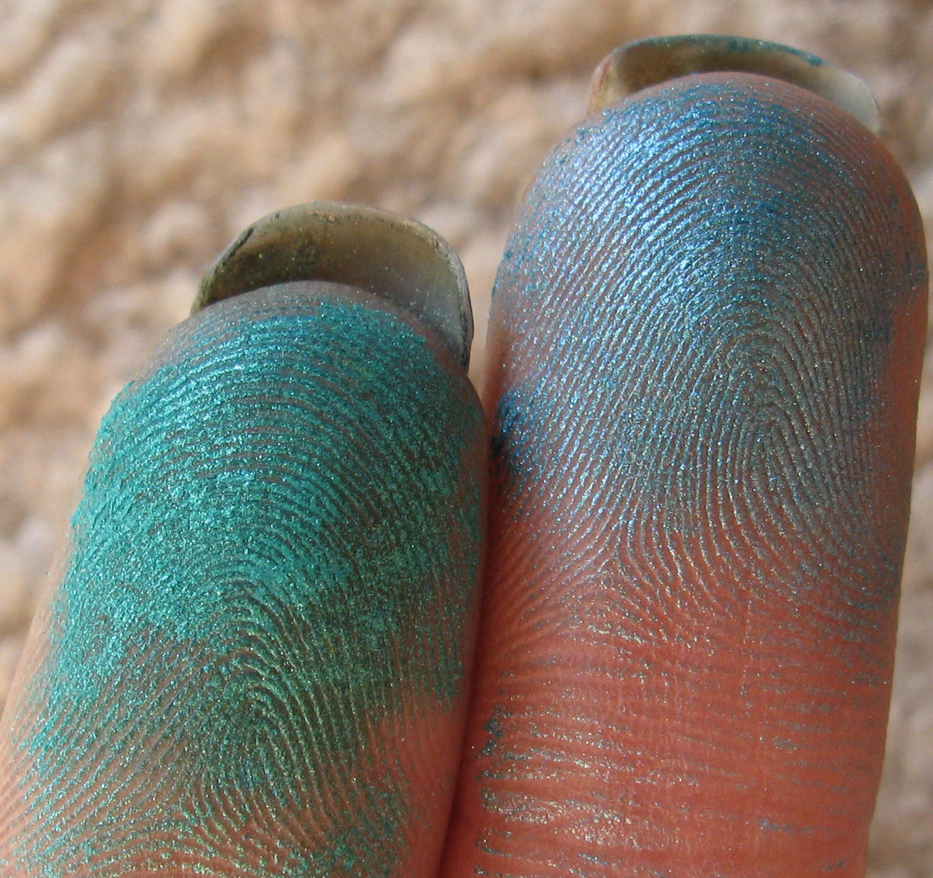
The aquas or blue greens are: Ocean Green, Pisces Blue, Indian Blue, Capricorn Sea


Ocean Green and Pisces Blue are similar in that both are blue with a greenish gold reflection. Indian blue is a nice rich blue with green undertones making it one of my favorite colors. True Green is far more "aqua" than green which is why it's here.. Coral Reef is a nice color but even in polish it's almost matte. Capricorn Sea
Ocean Green, Pisces Blue, Indian Blue, Capricorn Sea


True Green, Coral Reef Blue

Greens are as follows: Hilite Green, Green Apple, Taurus Orion, Shamrock Green, Apple Green Pop!, Pennsylvania Green, Deep Green, Cyprus Green, Aquarius & Emerald.


Hilite Green is identical in color to both Frosty Glitter Green and SuperNova Green from The Conservatorie. Taurus Orion is another of those sparkly colors that turns matte when used in polish. Pennsylvania Green looks a lot like Majestic Green from Coastal Scents- both are green with richer green interference (view comparison here). Deep Green and Cyprus Green are ok but in polish become even more plain. Aquarius doesn't strike my fancy either and so I haven't used it in polish. Emerald, in case you've wondered doesn't look like Coastal Scents' Emerald Isle, Emerald is sharper, less olive toned.
Hilite Green, Green Apple, Taurus Orion, Shamrock Green


Apple Green Pop!, Pennsylvania Green, Deep Green , Cyprus


Aquarius & Emerald


Warm Colors... coming when the sun cooperates. -MK
Related Entries:
:D I understand the frustration, cannot do any swatching during midweek myself because it's dark when I go to work and dark as I return from work. All the swatching has to be left for weekends - bf is getting annoyed of me not spending my time with him. Even EOTD's have to be taken at the office, so far have not been caught. Am waiting for March, I crave light.
ReplyDeleteIMHO sun is not that important for swatching, slight overcast is best. But during winter when it's snowing or raining - much too dark.
The optimal lighting around here for photography is outside on my balcony, between 9am and 11am. I could go farther outside to do it later in the day but I live in an apartment complex and if neighbors saw me, they'd be wondering why the crazy lady has a camera and colored stripes on her arms and legs. If my husband was home when I was swatching, he knows he'd be wearing the stripes so he avoids me. Maybe you should try that & b/f won't complain so much! ;-)
ReplyDeleteI think my neighbors already think I'm some nut-case photographing from my window all the time - they do not know the camera's pointed at me :D
ReplyDeleteBf has darker skin and hairy hands - he would not do... but perhaps - on his back? :D
His back could work unless he has a hairy one. If hubby would let me near him, I'd use his back. Just think of the expanded work surface!
ReplyDelete